Unveiling the New Look: Embracing Dark Mode in Valentina Project

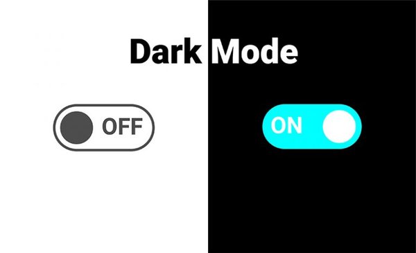
Valentina 0.7.53 introduces a dark mode feature, which was a highly requested enhancement. The implementation involved customizing the user interface, incorporating built-in icon themes for Windows and macOS, and building a custom system to adapt the canvas-like scene to dark mode. Users can opt for explicit control over the dark or light themes, and the color schemes of the user interface and scenes can be customized by editing specific files. Valentina’s dark mode enhances the visual experience while maintaining the integrity of its functionality.
Dark mode has become an increasingly popular feature in software applications and websites, and the Valentina project is no exception. With the future release of Valentina 0.7.53, users are treated to the long-awaited dark mode feature, an enhancement that has been a favorite request among users. This blog post delves into the exciting changes that this update brings, the technical intricacies of its implementation, and how to make the most of this new feature.
A Journey to Dark Mode
The Early Days
From its alpha version, the demand for dark mode in Valentina was persistent. The initial implementation seemed straightforward, yet a roadblock emerged — scenes. Scenes, where the heart of the user’s work unfolds, proved to be the most crucial yet challenging aspect to adapt. Despite this hurdle, the users’ voices and continuous encouragement kept the flame alive, serving as a reminder of the significance of this feature.
Untangling Complexity
Transitioning to dark mode was no trivial task. The first piece of the puzzle was to customize the user interface. Open-source projects like BreezeStyleSheets and QDarkStyleSheet paved the way, with BreezeStyleSheets become our final choice due to its expanded capabilities and inclusion of light themes. It also offered insights into managing standard Qt icons.
Icon Themes and Platform Harmony
Another challenge lay in icon themes—a collection of icons adhering to the Icon Theme Specification. While Linux users could seamlessly switch icon themes, this feature was missing on Windows and macOS. Valentina tackled this by incorporating built-in icon themes, catering to Windows and macOS aesthetics, enhancing native harmony and aesthetics.
Welcoming Native Support
The advent of native dark mode support in Windows 10 17763 and macOS 10.14 was a turning point. Although available, the Valentina project initially disregarded it due to the scene-related complexities. As the times changed and Qt library added support, it was time to reconsider and integrate native dark mode capabilities.
Piecing Together the Scene
The canvas-like scene introduced its own challenges. Without a standardized approach to styling objects on it, a custom system was indispensable. Valentina took the initiative to build this system, enabling the adaptation of the scene to dark mode seamlessly.
The Finishing Touches
Custom icons and tool cursors formed the next battleground. Leveraging icon themes wherever possible, Valentina bridged the gap by dynamically replacing icons based on the chosen theme. This entailed creating dark mode versions of each custom icon, ensuring a consistent visual experience.
Bridging Four Icon Themes
Valentina’s dark mode journey culminated in unifying all components. With native dark mode and light theme support, the project now intelligently detects the operating system’s capabilities and user preferences. This intricate web of checks ensures that users enjoy the best possible experience, with four distinct icon themes catering to different permutations.
Navigating the New Interface
Embracing Dark Mode
For Windows users, embracing the native dark mode requires Windows 10 17763 or later, coupled with Valentina built on Qt 6.5. macOS users face fewer obstacles due to the migration of most of them to newer macOS versions.
Making it Yours
By default, Valentina follows the system’s appearance preferences. Users can opt for explicit control by visiting File > Preferences > User Interface and selecting either dark or light themes. After applying the change, a restart might be necessary for the new look to take effect seamlessly.
Perfecting the Palette
Valentina empowers users to shape their experience. The color schemes of the user interface and scenes can be customized by editing the following files:
- breezethemes/dark/stylesheet.qss
- breezethemes/light/stylesheet.qss
- scenestyle/dark/style.json
- scenestyle/light/style.json
While changes require recompilation, these files offer an opportunity for those with a flair for design to experiment.
Conclusion
The journey to dark mode in the Valentina project has been one of tenacity and innovation. From grappling with custom scenes and adapting to native dark mode support, to harmonizing icon themes across platforms, the project’s evolution is a testament to its commitment to user satisfaction. Valentina’s dark mode opens up new vistas of user customization, enhancing the visual experience while maintaining the integrity of its functionality. So, go ahead and explore the new dark mode, and embrace the elegance it brings to your pattern-making and cutting endeavors.
Comments
No comments yet.